Web design · Development · Content systems
Websites built for people, content, and change.
Selected website work spanning global content operations, focused rebuilds, visual storytelling, and an evolving personal practice.
Back to selected workGlobal Website Management
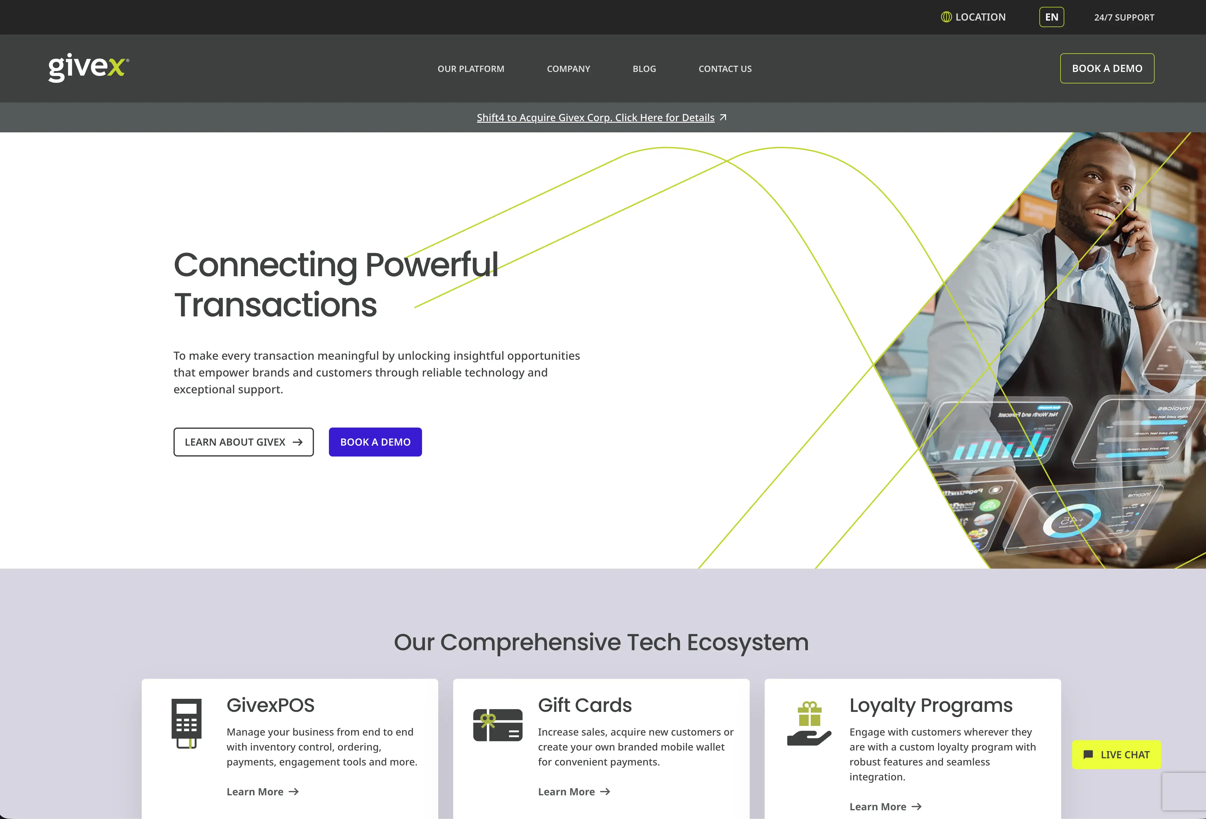
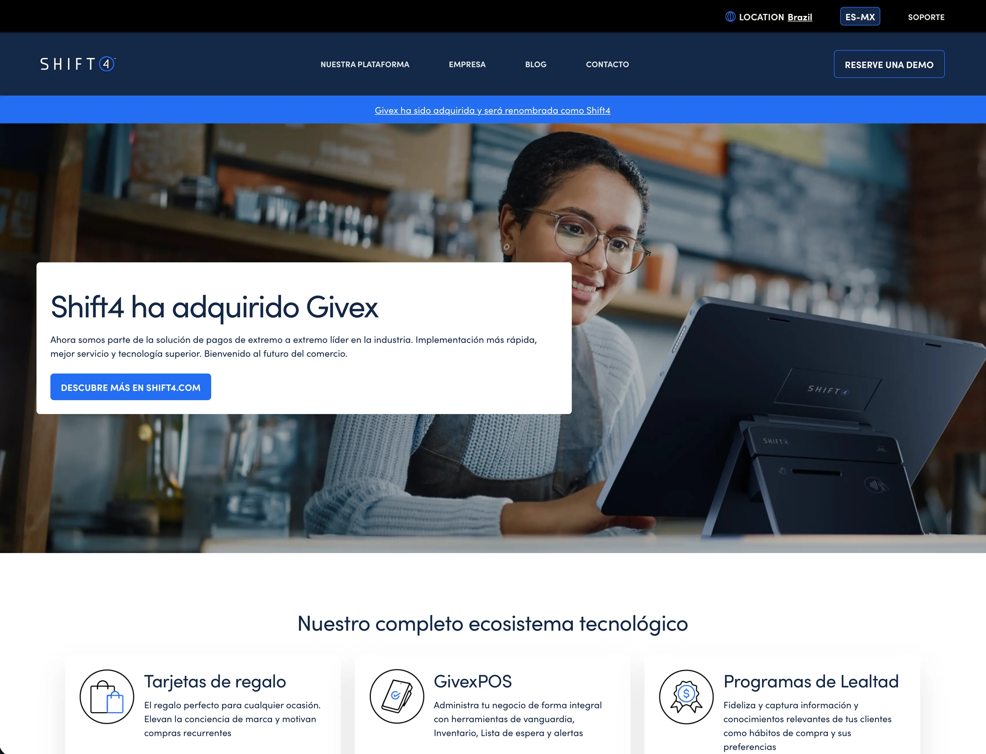
I helped coordinate Givex's migration from its legacy CMS to a global WordPress platform before becoming the primary internal owner of the corporate website. I managed content, landing pages and digital experiences across multiple international regions while maintaining consistency within an established design system.
- Role
- Website Management
- Platform
- WordPress + Gutenberg
- Regions
- Canada · United States · Mexico · Brazil · United Kingdom · Australia
- Design
- Original website by Massive

Primary internal website owner.
Following the launch of the new WordPress platform, I became the primary internal point of contact for Givex's corporate website. I managed day-to-day website operations, created new pages, supported regional marketing teams and ensured the platform remained organized and consistent across multiple international markets.
- 6
- International regions
- ~30
- Core pages per major region
- ~60
- Landing pages created or maintained
What I worked on
- 01
Global Website Operations
Managed day-to-day WordPress publishing across product pages, blogs, navigation, multimedia and regional content, while coordinating website requests from marketing and internal teams.
- 02
Landing Pages & Page Building
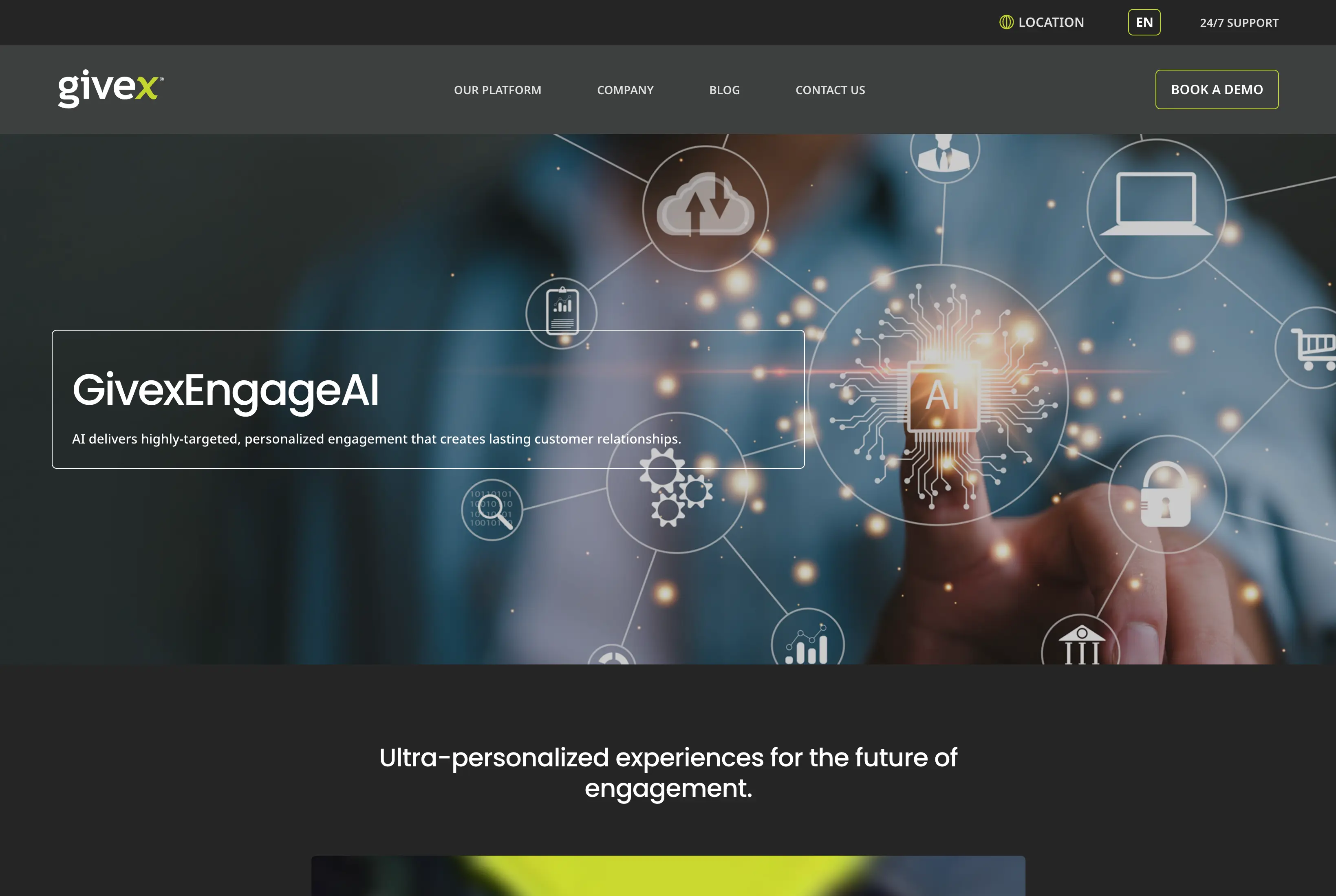
Created and maintained approximately 60 landing pages for products, campaigns, trade shows, acquisitions and customer communications using Gutenberg, reusable modules and established templates.
- 03
Regional Management
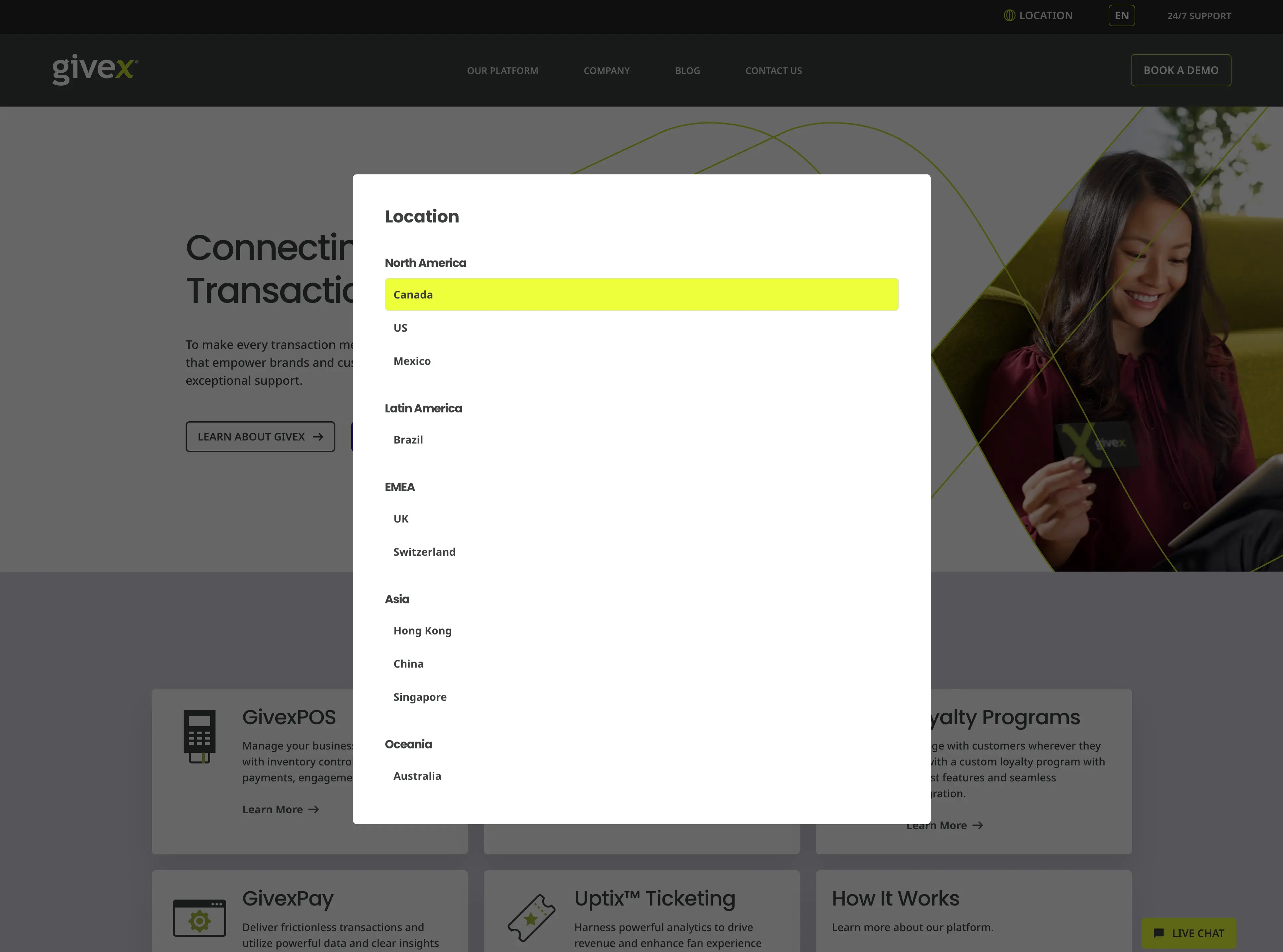
Managed localized content across Canada, the U.S., Mexico, Brazil, the U.K. and Australia, supporting different languages, products and regional business priorities.

One website, multiple markets. Regional teams required different content, languages, products and business priorities while still operating within one consistent global platform. - 04
CMS Administration & Optimization
Managed users and permissions, regional blog access, plugins, Yoast SEO, redirects, navigation and selected CSS updates, while using Hotjar and analytics to identify usability and content improvements.
From Migration to Ownership
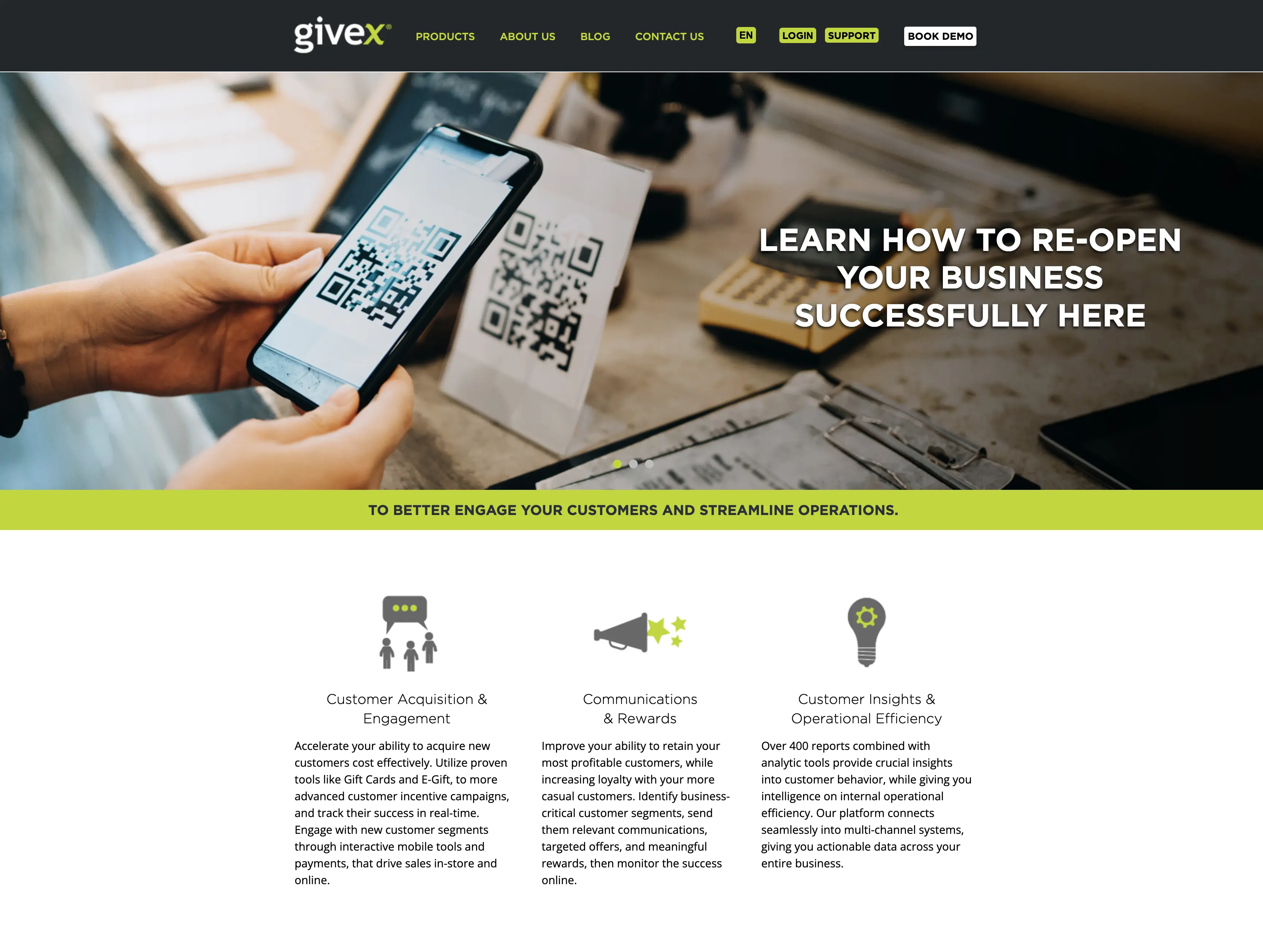
Before becoming the primary website owner, I participated in Givex's migration from the legacy Marquis CMS to WordPress. Working alongside Massive and internal stakeholders, I helped gather regional requirements, review layouts, coordinate localized content and support the transition to a scalable global platform.


Pages I Created
Beyond maintaining existing content, I created new product, campaign and landing pages using Gutenberg, reusable modules and established templates. I worked within Givex's existing design system while adapting layouts and content for different business needs and responsive breakpoints.
Shift4 Transition
Following Shift4's acquisition of Givex, I helped update regional websites and customer-facing messaging to support the transition while maintaining continuity across international markets.

Next project
02
Emigrar Canada
Website Design & Digital Ownership
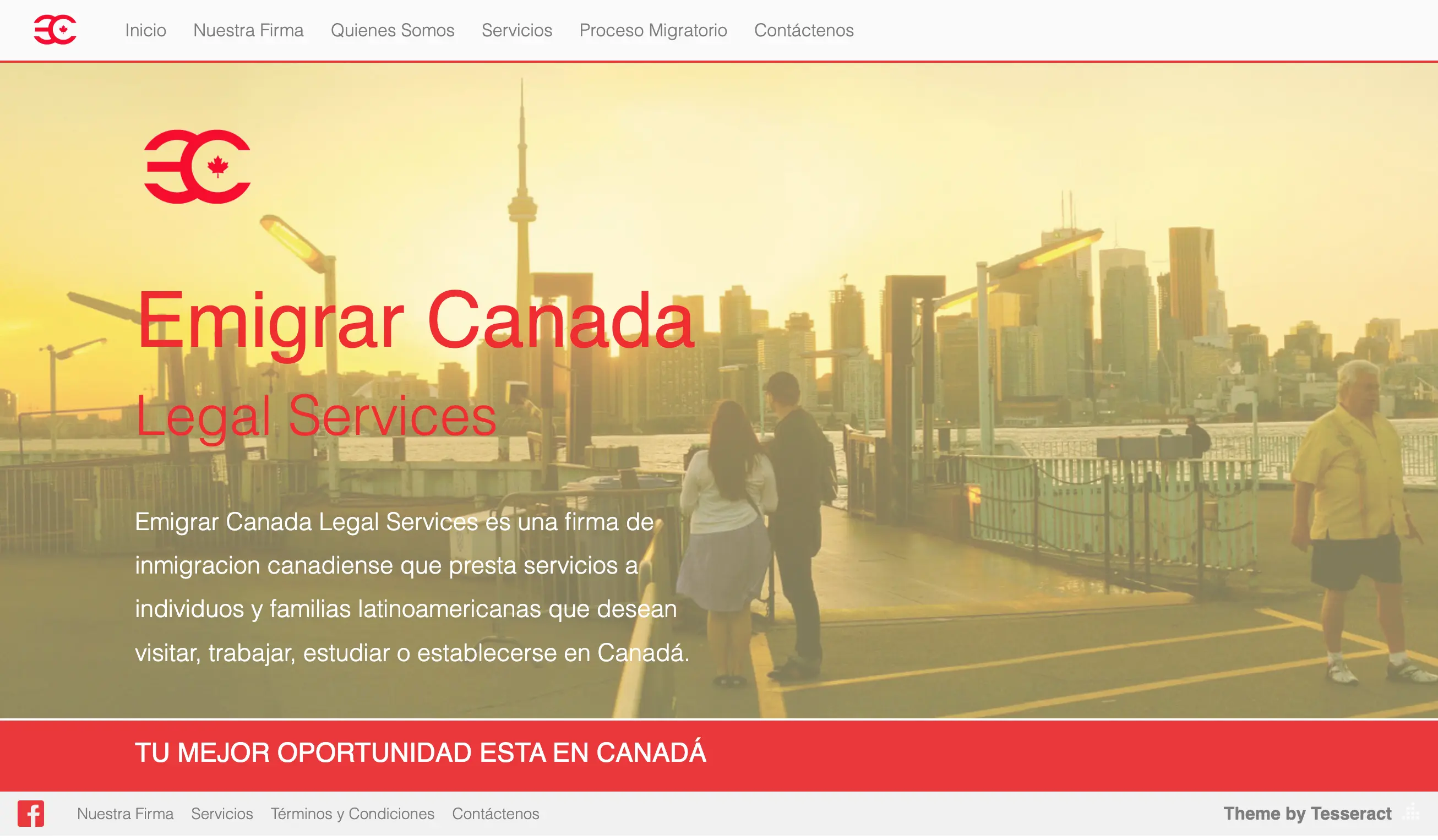
Emigrar Canada is an immigration consultancy helping people navigate the process of studying, working and building a life in Canada. As the business expanded its services and digital presence, I became responsible for much of the infrastructure supporting that growth. I redesigned and rebuilt the website, evolved the brand, organized an expanding catalogue of immigration services, created lead-generation and WhatsApp contact flows, and continue to manage the site's content, SEO, performance and technical maintenance.
- Role
- Web Design + Digital Ownership
- Platform
- WordPress + Elementor
- Focus
- UX · Leads · SEO · Performance


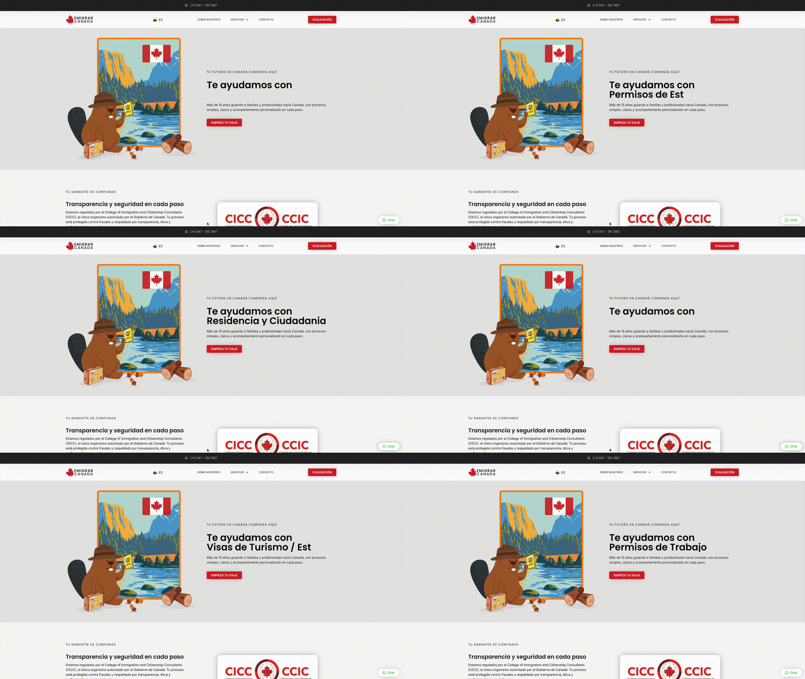
From the original website to an ongoing digital system
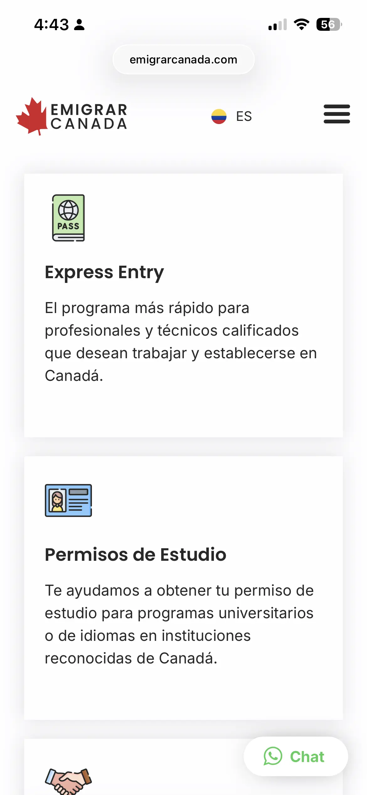
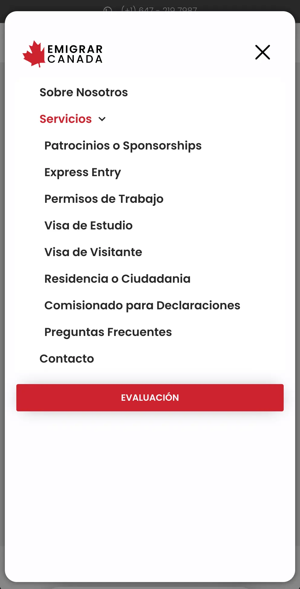
As the business evolved, its website gained clearer hierarchy, a stronger mobile experience and more direct paths to services and contact.
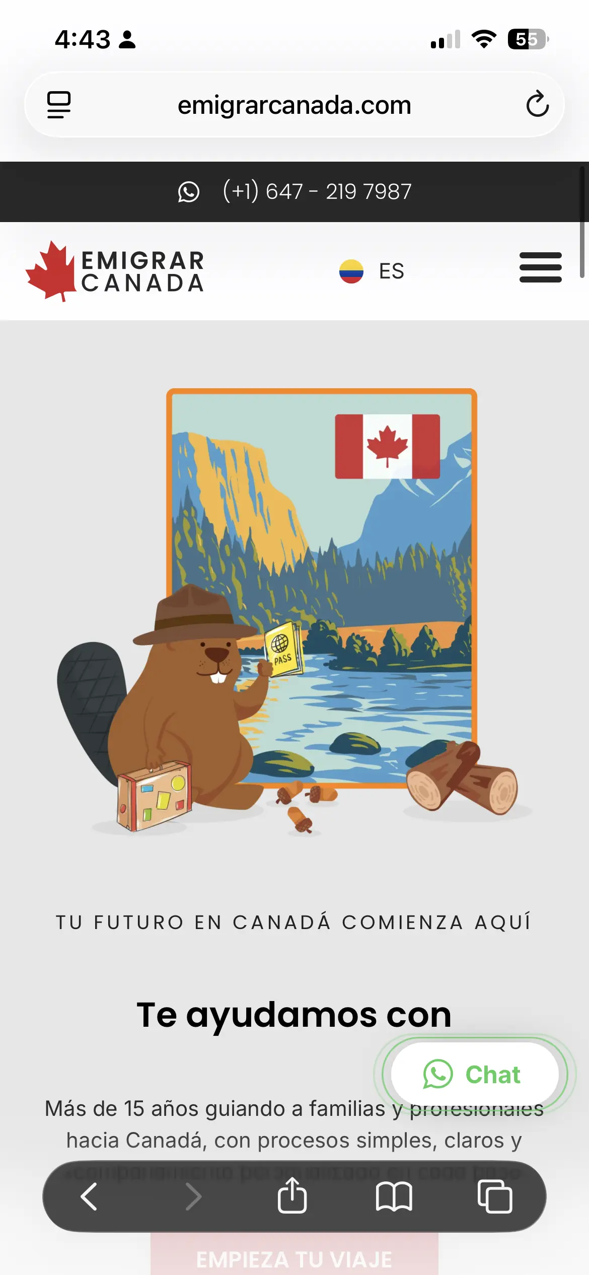
Clear on every screen.
Responsive design and clearer information architecture make complex services easier to navigate on mobile.


Turning visits into conversations.
The website is designed around what happens after someone arrives: helping qualified visitors take action and contact the business.
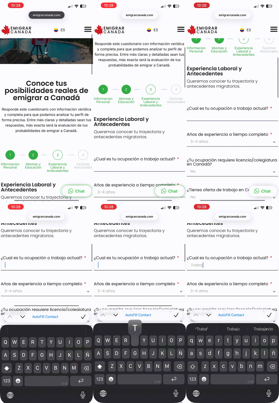
Qualification
A guided evaluation.
A multi-step form turns complex intake into manageable stages.


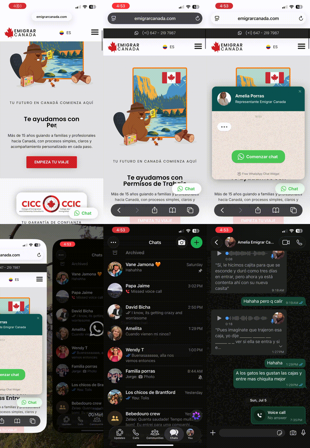
Conversation
A direct route to WhatsApp.
Qualified visitors can move directly from browsing to conversation.


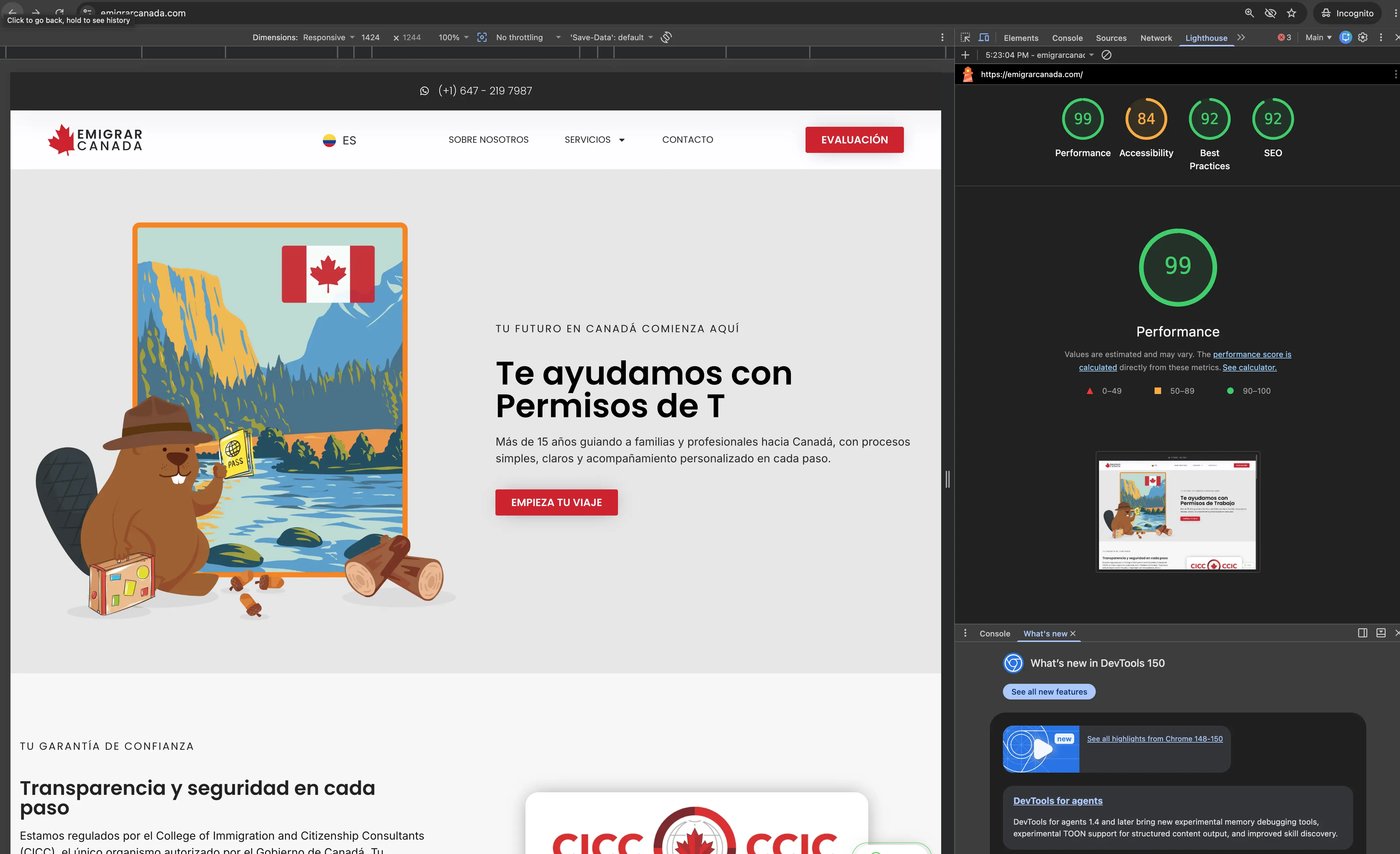
Performance + visibility.

Desktop Lighthouse performance
A 99 performance score indicates that the site loads quickly and responds efficiently under the conditions of this test. For Emigrar Canada, that means visitors can reach service information, evaluation forms and contact options with less friction, while strong technical performance also supports usability and search visibility.
Results vary by device, connection and test conditions.
Ongoing management · WordPress maintenance · Content updates · SEO · Performance monitoring · Plugins · Backups
More than a redesign: an ongoing digital system connecting brand, services, lead generation and website performance.
View the live websiteNext project
03
Circling Colombia
Redesigning a travel website to look better, work better, and be easier to manage.
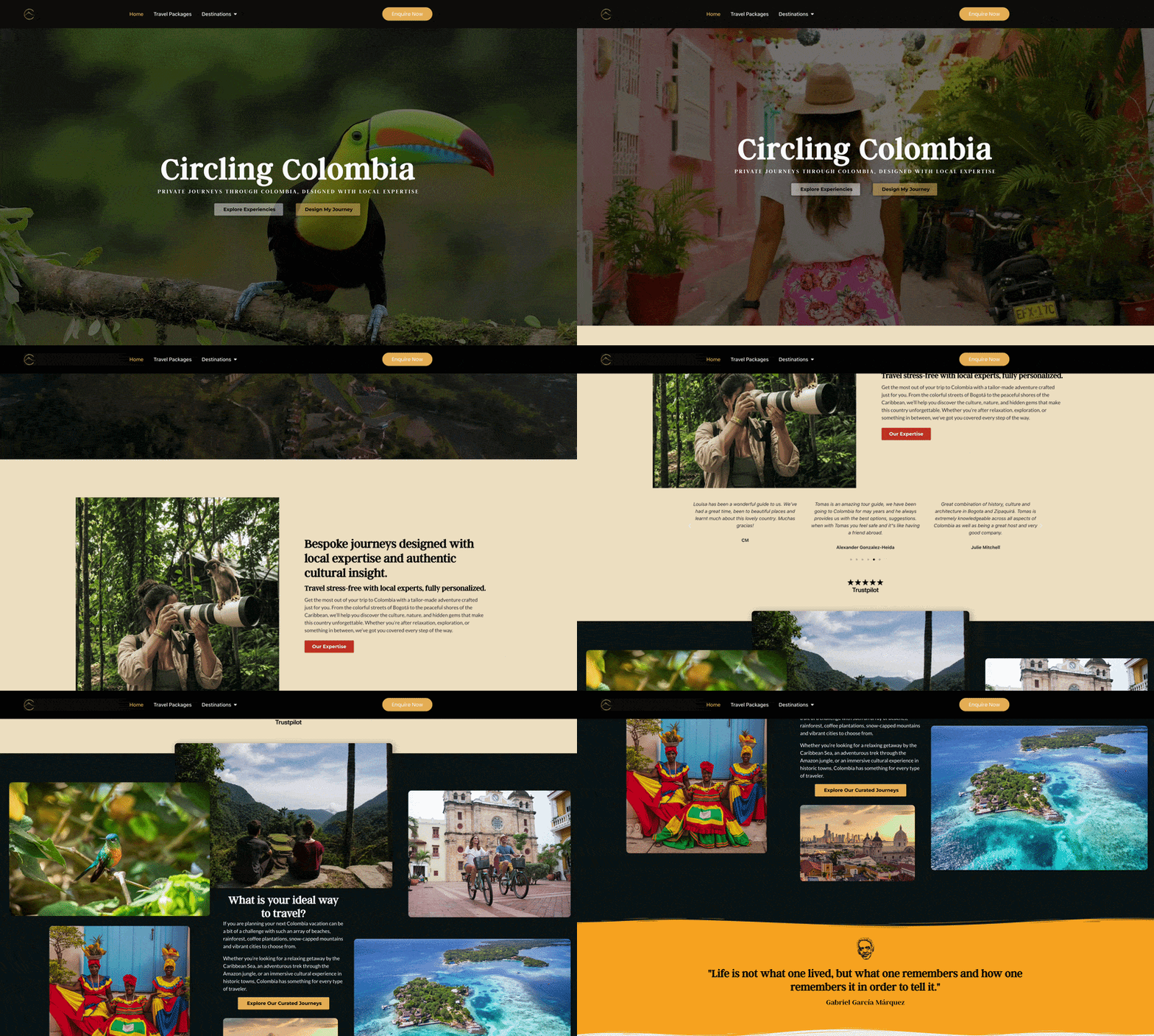
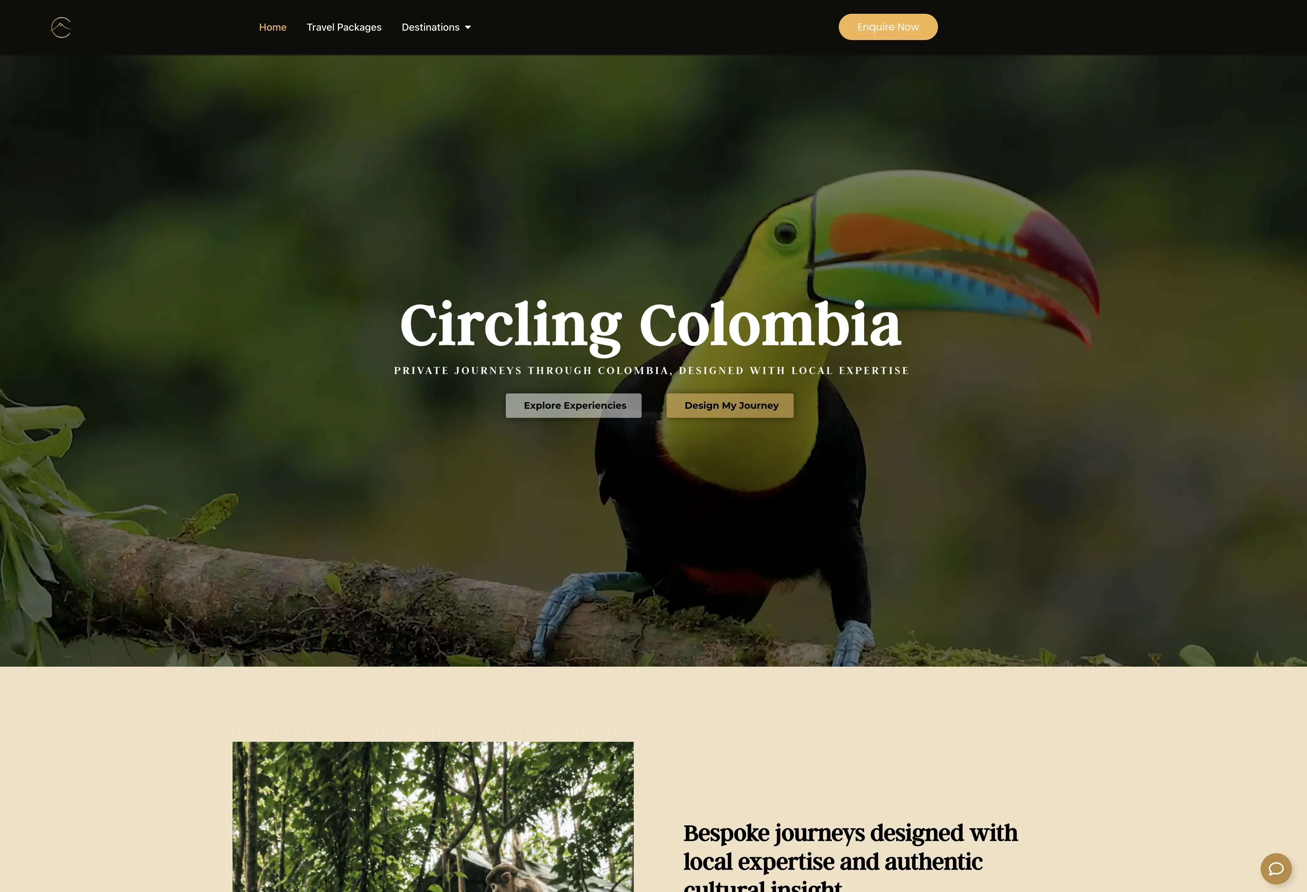
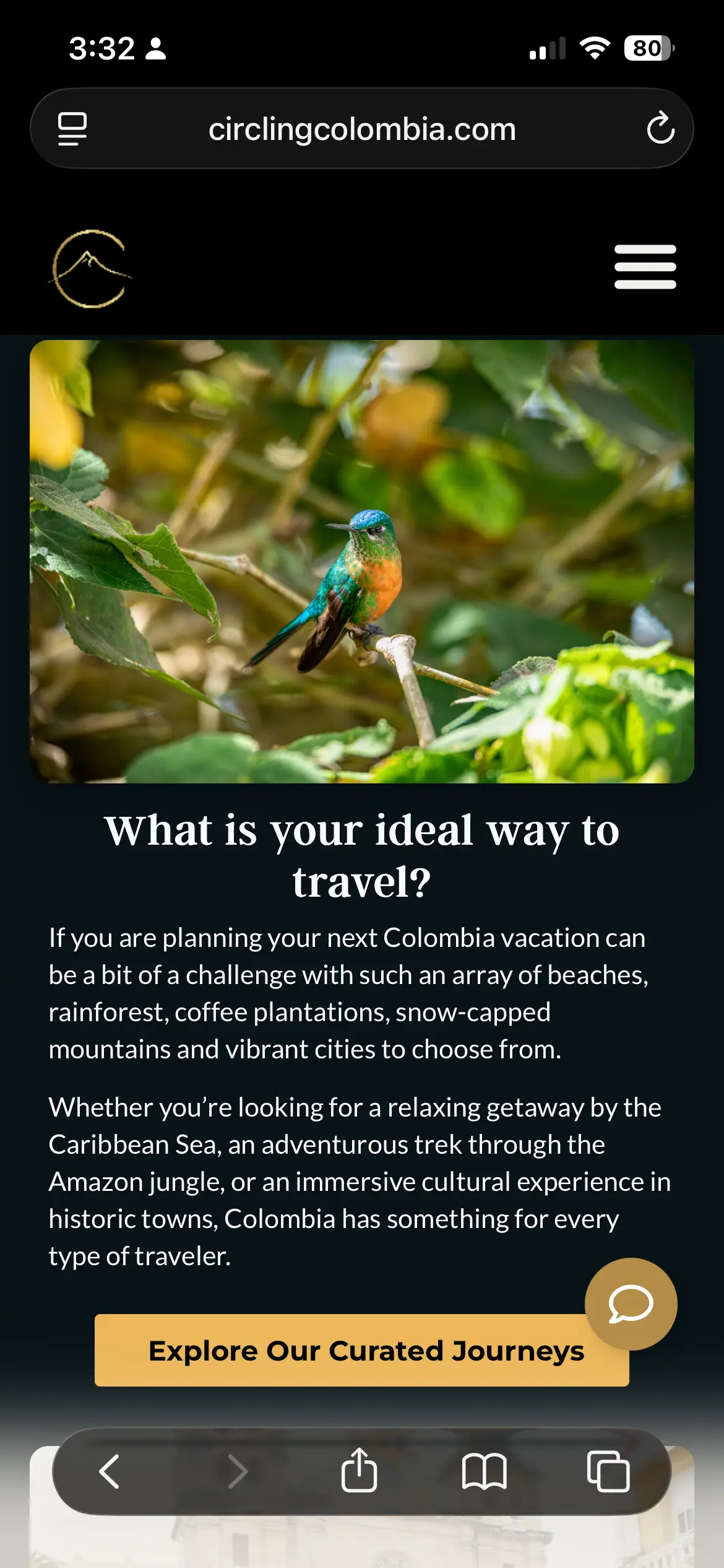
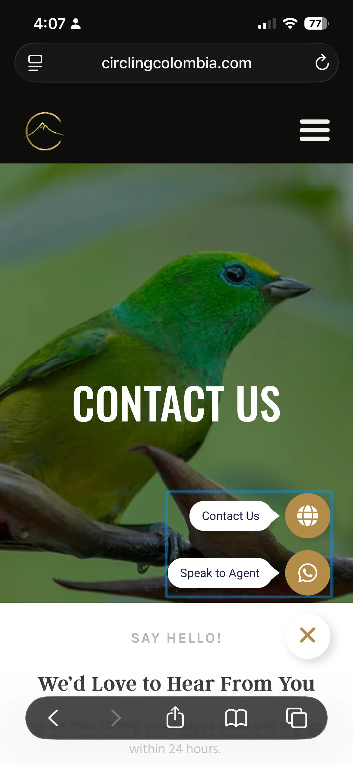
Circling Colombia came to me with an existing WordPress website built from a generic travel template that no longer reflected the experience they wanted to offer. I redesigned the site in Elementor Pro, established a consistent visual system and reworked its content structure to create a more polished experience that the team could continue managing themselves.
- Role
- Web Design + Development
- Platform
- WordPress + Elementor Pro
- Focus
- Responsive Design · Content Systems · Lead Generation


Designing the site and the system behind it.
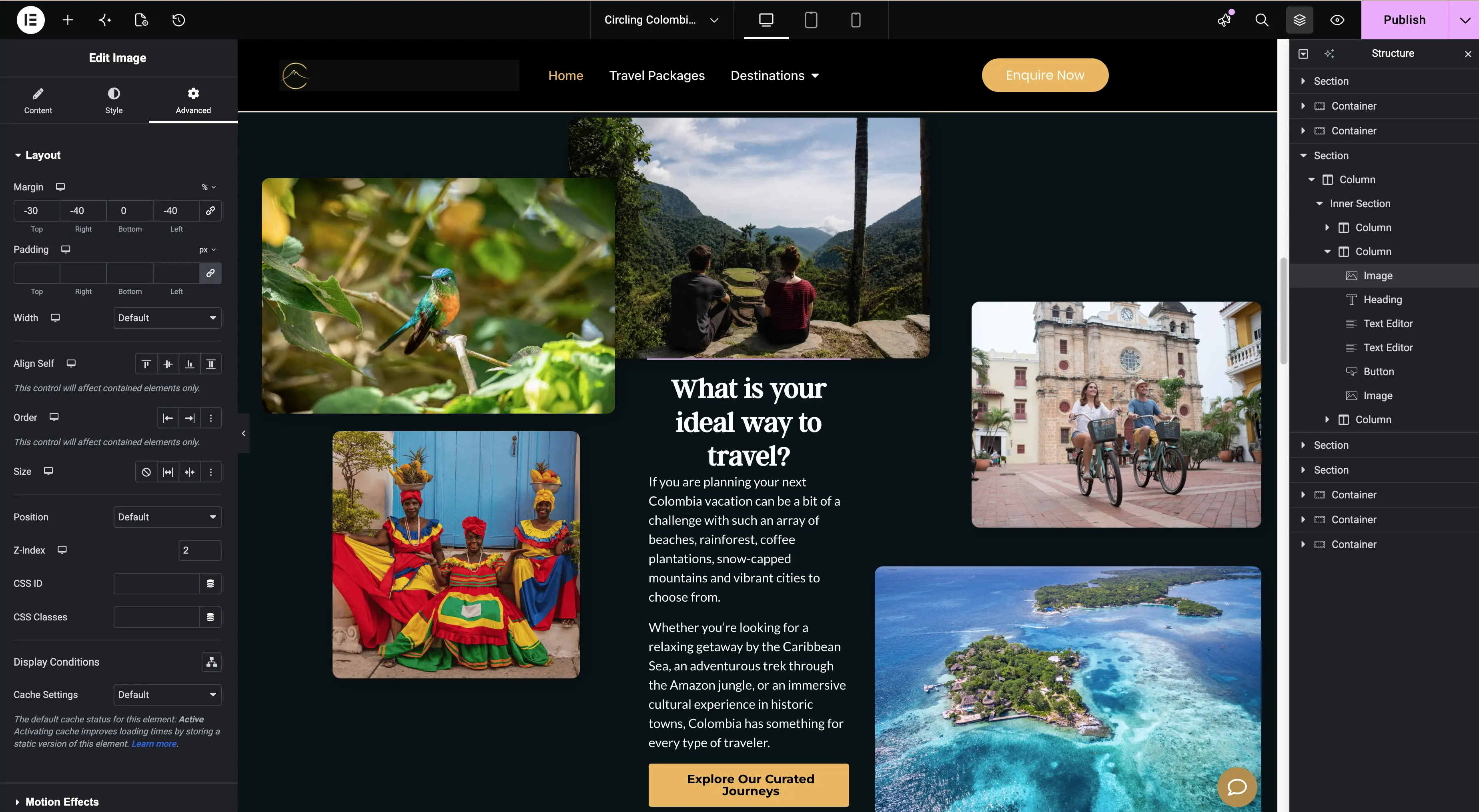
My role went beyond updating the site's appearance. I redesigned the experience while building reusable styles, templates and structured content workflows that would make it easier for the Circling Colombia team to maintain and expand the website without rebuilding pages from scratch.
What I worked on
- 01
Website Redesign
Reworked the existing travel template into a more intentional visual experience, introducing new layouts, imagery, a video-led homepage, cards, calls to action and responsive treatments.
- 02
Design System
Established global Elementor styles for typography, colours, buttons and recurring interface elements, creating a consistent foundation for future pages and content.

Elementor Pro used to construct the redesigned visual experience. - 03
Structured Travel Content
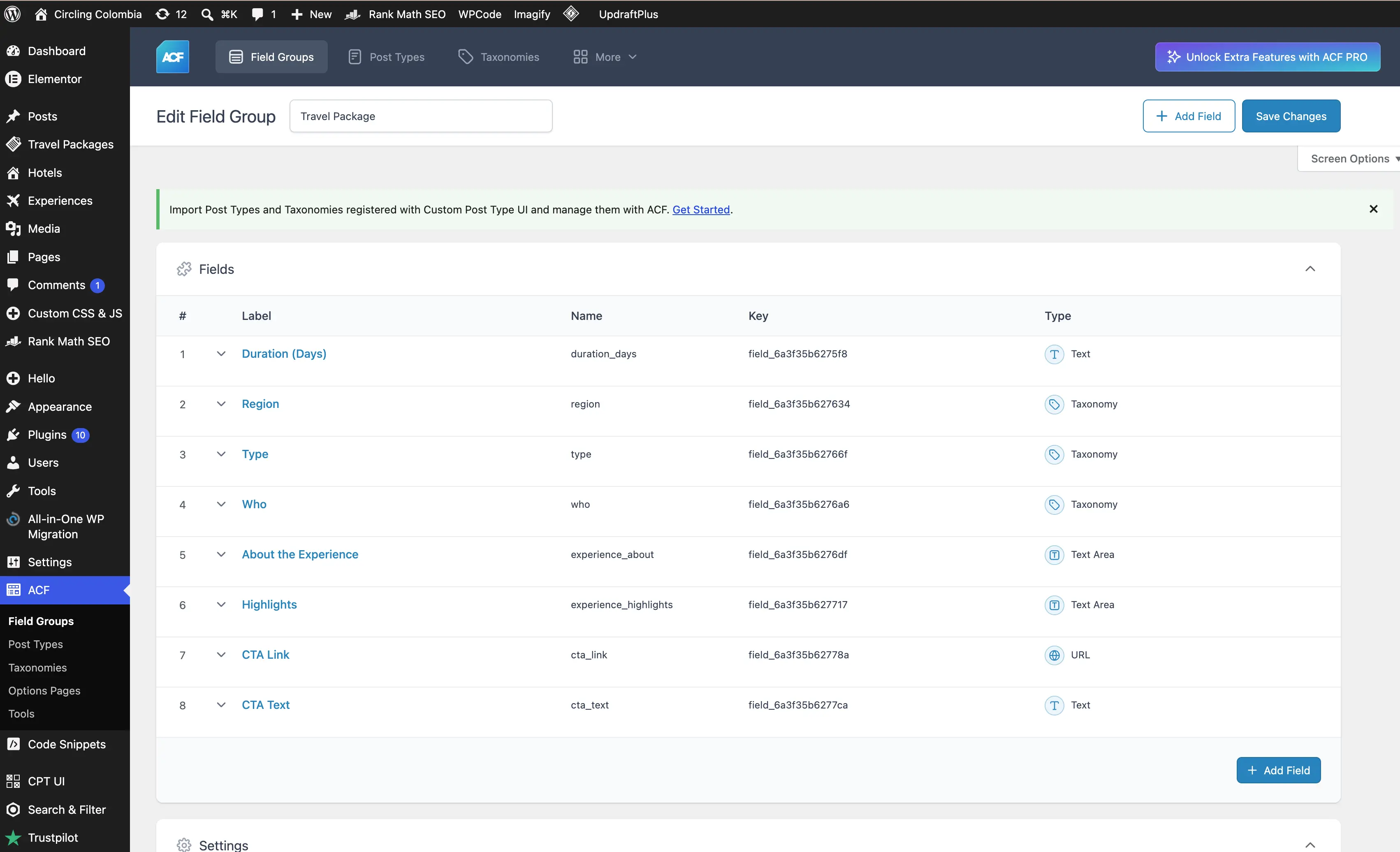
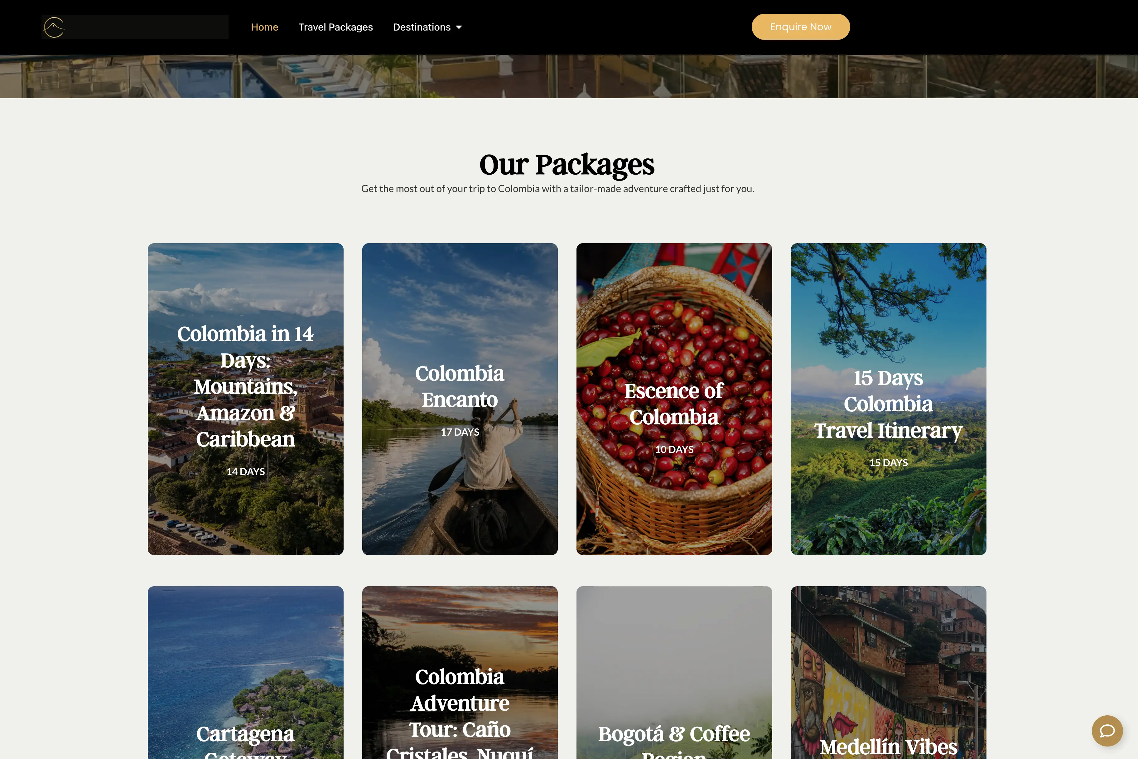
Created Custom Post Types, taxonomies and ACF fields for travel packages and related content, allowing information such as duration, region, type, highlights and calls to action to populate reusable templates.

Structured travel-package fields created with Advanced Custom Fields. - 04
Contact & Conversion Paths
Built clearer ways for visitors to take action through inquiry forms, contextual calls to action and direct WhatsApp access to an agent.
Built to grow with the business.
Instead of treating every travel package as a separate page-building exercise, I created reusable templates and structured content that allow the team to add and update experiences while keeping the design consistent across the site.


A more flexible travel website designed to grow with the business, not against it.
View the live websiteNext project
04
idanieltorres.com
idanieltorres.com
Designing my own portfolio became an experiment in how I want to build websites next.
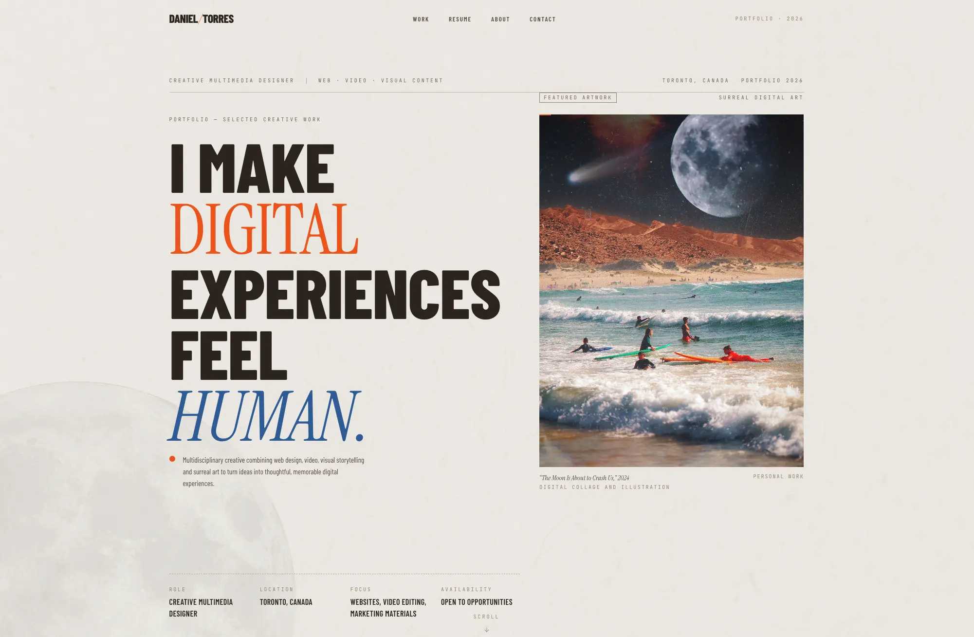
After years of working primarily with WordPress and Elementor, I wanted my own portfolio to be an opportunity to try something different. I used AI-assisted tools to explore ideas, move into a code-based workflow and learn a new way of building for the web. The tools accelerated the process, but the direction came through planning, critique and a lot of iteration.
- Role
- Creative Direction + Web Design + Development
- Platform
- Next.js + React + Tailwind CSS
- Workflow
- Bolt + ChatGPT + Codex + GitHub
- Focus
- Design Systems · AI-Assisted Development · Responsive Design

Planning the portfolio before building it.
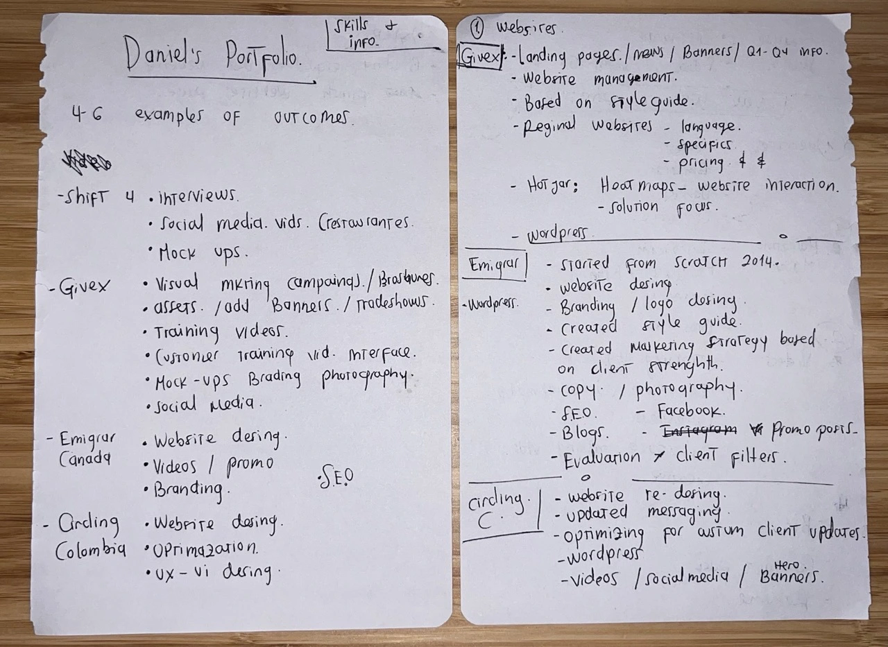
The project started by deciding what the portfolio needed to communicate, which work deserved emphasis and how each case study should support that story. Those priorities were mapped before they became interfaces and code.

What I worked on
- 01
Creative Direction
Defined the portfolio structure, visual direction, project hierarchy and editorial approach before translating those decisions into the site.
- 02
AI-Assisted Exploration
Used conversational AI and rapid visual prototyping to explore directions, critique ideas and iterate before moving approved decisions into development.
- 03
Development Workflow
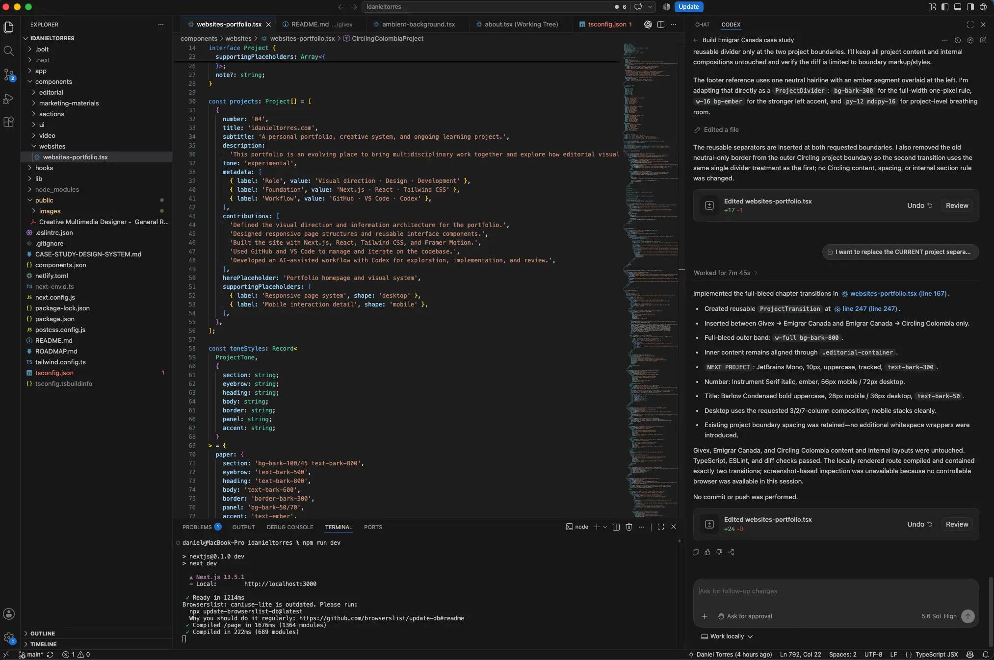
Built the portfolio with Next.js, React and Tailwind CSS, using Codex as an implementation partner while reviewing and refining the work locally.
- 04
Design System
Turned recurring decisions around typography, grids, spacing, captions, artifact framing and project transitions into a documented reusable case-study system.
A faster loop between idea and implementation.
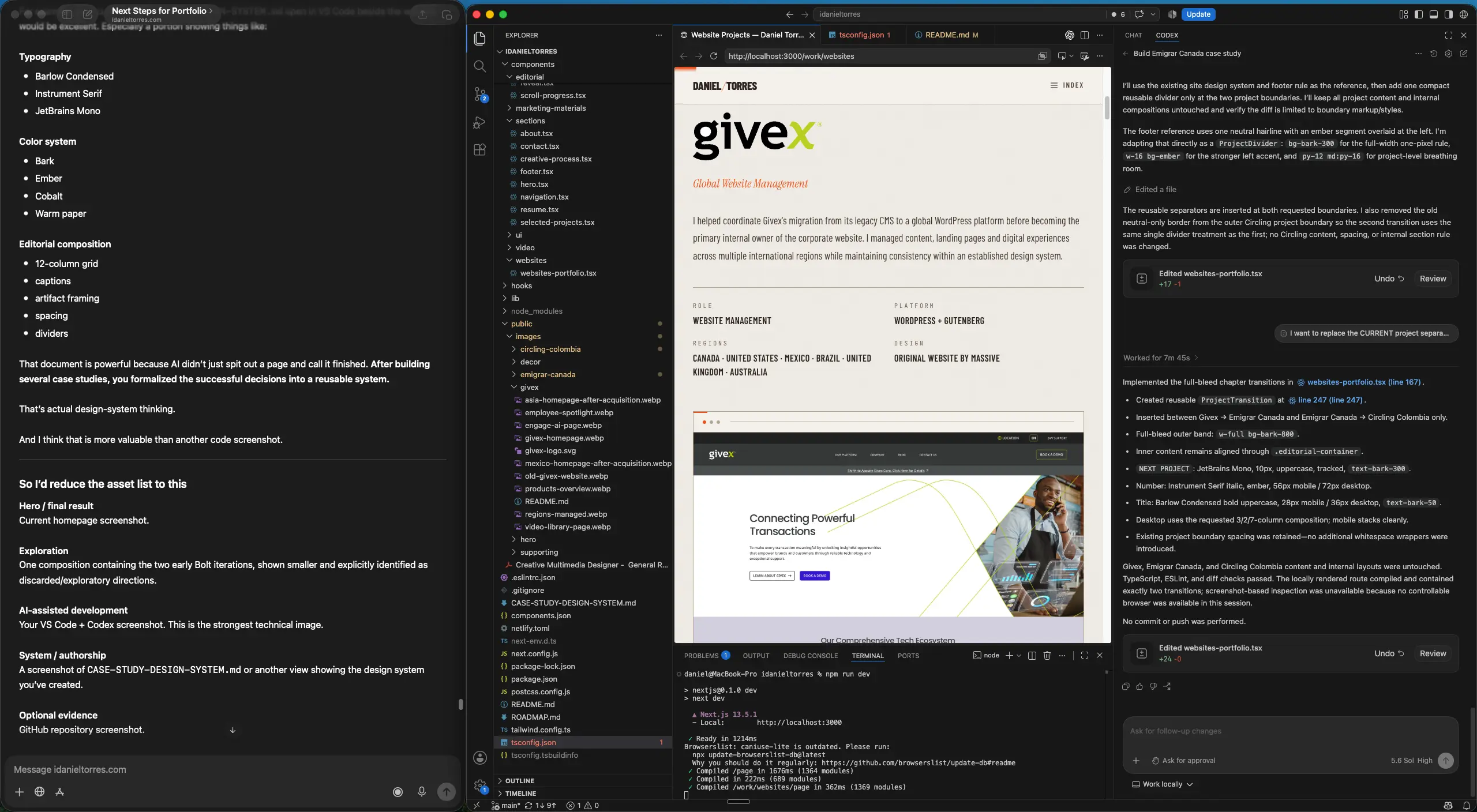
My workflow became conversational. I articulate ideas and feedback quickly, use AI to explore and clarify the direction, and move into Codex once the decisions are ready to implement. I review each result locally in the browser, challenge what isn't working and refine it again. The tools shorten the distance between idea and implementation; direction, judgment and final decisions remain part of the review.
The responsive implementation uses Next.js, React, Tailwind CSS and Framer Motion. Portfolio images are resized and converted to WebP to reduce unnecessary image weight and improve loading performance.
- Articulate→
- Explore→
- Implement→
- Review→
- Refine


- Next.js
- React
- Tailwind CSS
- Framer Motion
- Git / GitHub
- Responsive Design
- WebP Image Optimization
The experiment became a system.
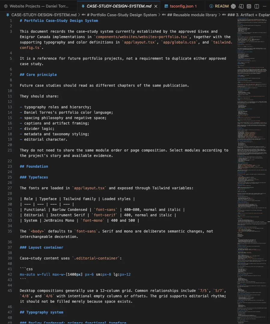
As the portfolio grew, I stopped treating each case study as an isolated page. The decisions that were working — typography, spacing, grids, captions, artifact framing and project transitions — were documented into a reusable case-study system. Future projects can now feel like different chapters of the same publication without repeating the same layout.
- Typography roles + hierarchy
- Editorial containers + 12-column composition
- Spacing + negative space
- Captions + artifact framing
- Metadata + divider logic
- Color usage + reusable modules

A portfolio built to show my work also became a way to change how I make it.
The project gave me a practical way to explore AI-assisted development without giving up the parts of the process I value most: visual judgment, iteration, structure and craft. The result is both a working portfolio and an evolving system I can continue building on.